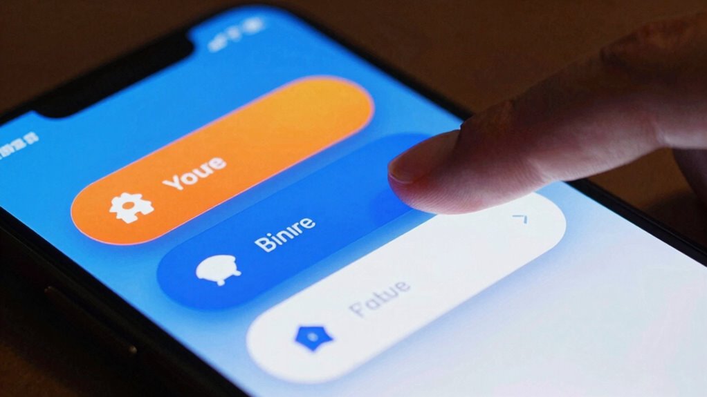
To make your mobile CTA buttons get tapped, focus on clear, bold designs with high contrast colors and action-oriented labels. Place buttons where users naturally look and easily reach—like near the bottom or edges of the screen—and guarantee they’re large, rounded, and spaced well for easy tapping. Test different sizes, colors, and placements to see what works best. Master these rules, and you’ll boost engagement—if you want to learn more, keep exploring the best strategies.
Key Takeaways
- Place CTA buttons above the fold and near screen edges, especially at the bottom, for natural thumb access and visibility.
- Use bold, contrasting colors and clear labels to make buttons stand out and instantly communicate their purpose.
- Incorporate strong action verbs and concise messaging to encourage immediate user engagement.
- Optimize button size, spacing, and placement through A/B testing to identify the most effective designs.
- Ensure accessibility with high contrast, large touch targets, and screen reader compatibility to reach all users.
Why Mobile CTA Buttons Are Critical for Engagement
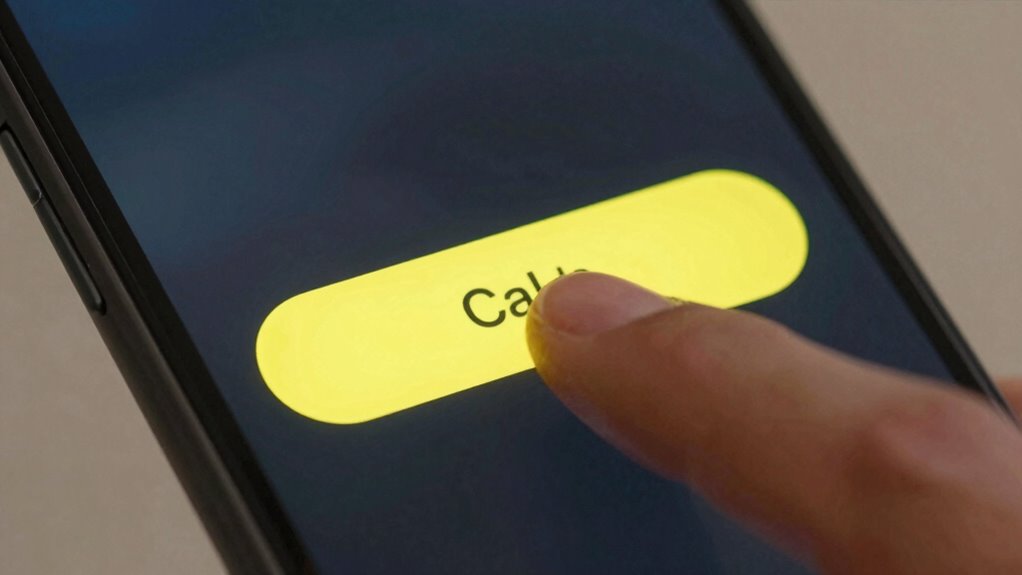
Mobile CTA buttons are essential because they directly influence user engagement and drive conversions. With the rise of gesture-based interactions, users expect seamless and intuitive ways to navigate your app. Incorporating gesture controls, like swipe or tap gestures, makes your CTA buttons more accessible and user-friendly. Voice command integration further enhances this experience, allowing users to activate buttons hands-free. When your buttons are easy to find and interact with, users are more likely to take action immediately. Effective mobile CTAs leverage these interaction methods to create a frictionless experience. This responsiveness not only keeps users engaged but also increases the chances they’ll complete desired actions, boosting overall conversion rates. Additionally, understanding projector contrast ratios can inform design choices that optimize visual clarity and engagement on mobile screens. Recognizing the importance of user interface accessibility can further ensure that your CTA buttons accommodate a diverse range of users, enhancing overall usability. In today’s mobile-first world, well-designed CTAs are key to successful user engagement.
How to Design Clear and Attention-Grabbing Mobile Buttons
To make your mobile buttons stand out, use bold colors that catch the eye without overwhelming the design. Clear labels guarantee users instantly understand what action they’re taking, reducing confusion. Combining these strategies helps create buttons that are both noticeable and easy to use. Incorporating generative AI in entertainment can further enhance user confidence and engagement. Additionally, understanding digital interface principles can guide you in designing more intuitive and effective mobile buttons.
Use Bold Colors
Ever wondered why some buttons instantly catch your eye? It’s often because they use bold colors that stand out. Color psychology plays an essential role here—bright, vibrant hues can evoke excitement or urgency, prompting users to act. When choosing colors, consider your brand’s personality to maintain consistency; a consistent palette reinforces recognition and trust. Bold colors aren’t just eye-catching; they also guide users toward your primary CTA, making it clear where to tap. Avoid dull or muted tones that blend into the background. Instead, select colors that contrast sharply with your app’s overall design. This strategic use of bold colors ensures your buttons grab attention quickly and drive engagement, keeping your CTA clear and irresistible.
Employ Clear Labels
Have you noticed how some buttons instantly tell you what to do? That’s the power of clear labels. Your button labels should be straightforward, using simple language that leaves no doubt about the action. Avoid vague terms like “Click Here” or “Submit,” and instead use specific phrases like “Download Now” or “Get Your Quote.” Clarity and simplicity are key to grabbing attention and encouraging taps. Make sure your labels are concise but descriptive enough to guide users confidently. When labels are clear, users understand exactly what will happen when they tap, reducing hesitation. Well-crafted button labels improve user experience and boost conversions by making your calls to action obvious and inviting. Clear labels are essential for effective mobile CTA design. Additionally, understanding content clarity can help refine your messaging to ensure users quickly grasp the intended action. Focusing on label consistency across your interface further enhances user understanding and trust. Moreover, maintaining visual hierarchy helps users prioritize actions and navigate your interface more intuitively. Ensuring your labels align with user expectations can also reinforce user trust and make interactions more seamless.
Choosing the Best Size, Shape, and Color for Your CTA

How do you choose the right size, shape, and color for your CTA buttons? Start by considering button size—make it large enough to tap easily without overwhelming the screen. The shape and color should create a clear visual hierarchy and contrast against the background, drawing attention without clashing. Rounded corners are common for a friendly look, but ensure the shape matches your overall design aesthetic. The color must stand out and align with your brand, guiding users toward the desired action. Use contrast strategically so the button is distinguishable from surrounding elements, making it impossible to miss. Balancing size, shape, and color guarantees your CTA commands attention and encourages clicks effortlessly.
How to Write Action-Oriented Text That Encourages Clicks

Crafting action-oriented text for your CTA buttons is essential to motivate users to click. Your text should be clear, direct, and compelling. Use these strategies:
Use clear, compelling CTA text with strong verbs, concise messaging, and strategic placement to boost user engagement.
- Start with strong verbs like “Get,” “Download,” or “Join” to create immediacy.
- Be concise, keeping your message short so it fits easily within the button.
- Leverage color psychology by choosing button colors that evoke the right emotions and draw attention.
- Consider button placement; position your CTA where users naturally look, reinforcing the action with your text.
- Incorporate user-centric design principles to ensure your CTA stands out in the context of the overall user experience.
- To enhance effectiveness, tailor your CTA text to align with home EV charging concepts so users see it as relevant to their needs. Additionally, understanding effective button design can help you optimize your CTAs for better engagement.
Where to Place Your CTA Buttons for Maximum Impact

You want your CTA buttons to grab attention right away, so placing them above the fold guarantees they’re immediately visible without scrolling. But don’t forget to take into account the bottom of the screen, where users often look before leaving a page or completing an action. Balancing these positions can lead to higher engagement and more clicks. Incorporating clear visual cues can further guide users toward the desired interaction points.
Visible Above the Fold
Have you ever wondered why some CTA buttons grab your attention immediately? The key lies in strategic button placement and establishing a clear visual hierarchy. To maximize impact, place your CTA above the fold, ensuring it’s instantly visible without scrolling. Consider these tactics:
- Position your button near the top of the screen for immediate visibility.
- Use size and color to create a strong visual hierarchy, making the CTA stand out.
- Keep surrounding content minimal to reduce distraction.
- Test different placements to see which gets the most taps.
- Understand the importance of visual hierarchy to guide users naturally toward the desired action.
- Incorporate design principles that emphasize contrast and clarity to enhance user focus.
Bottom of the Screen
Ever wondered if placing your CTA at the bottom of the screen can boost engagement? It’s a strategic spot because it aligns with natural finger tap zones, making it easier for users to tap without stretching or awkward movement. Positioning your button near the screen edge guarantees it stays within easy reach, especially on larger devices. This placement leverages the thumb’s natural movement, reducing friction during interaction. Keep in mind, a well-placed bottom-of-the-screen CTA can improve click-through rates by tapping into users’ muscle memory and instinctive gestures. Just ensure it’s not hidden behind UI elements or too close to the device’s edge, which might cause accidental taps. Proper screen edge placement at the bottom optimizes ease of access and engagement. Additionally, understanding how the placement of UI elements impacts user behavior can help you design more intuitive and accessible interfaces. Using zoning strategies to position your buttons can further enhance user experience and interaction efficiency. Recognizing how user habits influence interaction patterns can also inform optimal placement choices. Incorporating ergonomic principles into your design can further improve usability and reduce user fatigue during repetitive tasks. Being mindful of natural device interactions can lead to more seamless and user-friendly designs.
Using Visual Cues and White Space to Focus User Attention
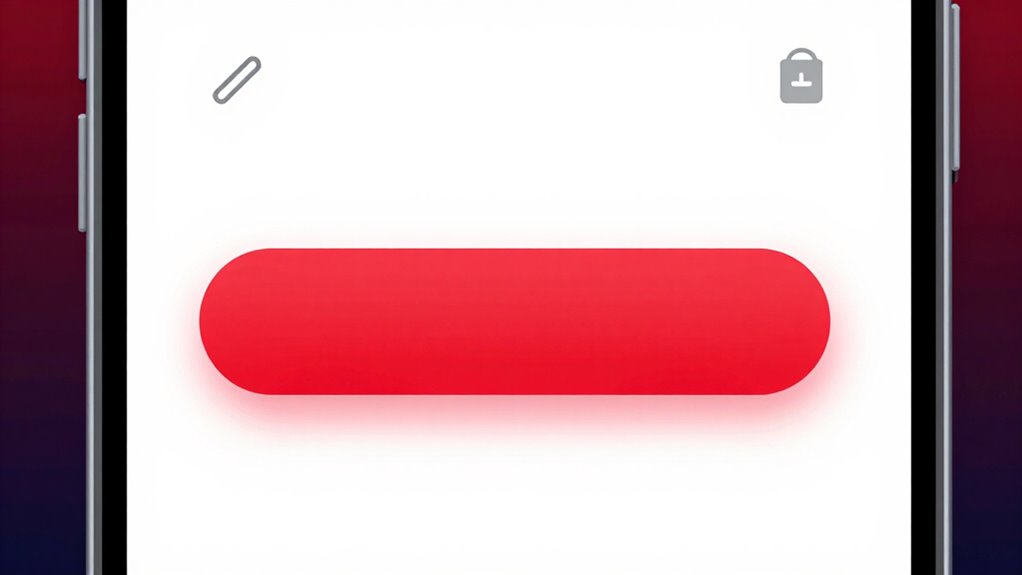
Visual cues and white space are powerful tools for guiding user attention and enhancing interface clarity. They help highlight important elements and reduce clutter, making your CTA buttons stand out. To effectively use these tools:
- Use visual cues like arrows or contrasting colors to direct focus toward your CTA.
- Allocate ample white space around the button, creating a clear visual hierarchy.
- Avoid crowding your interface; let white space separate elements for better readability.
- Incorporate subtle visual cues, such as shadows or borders, to make buttons more noticeable.
How to Test and Optimize Your Mobile CTA Buttons Effectively
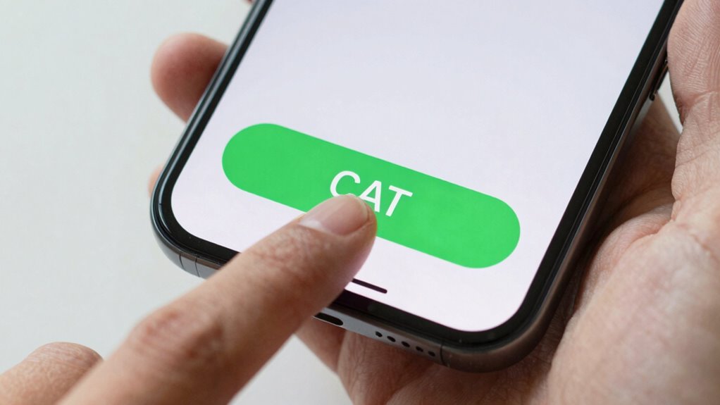
To guarantee your mobile CTA buttons perform at their best, you need to test and optimize them regularly. Conduct A/B testing by comparing different button designs, colors, and placements to see what resonates most with your users. Gather user feedback through surveys or direct interactions to understand their preferences and frustrations. Use this data to refine your CTAs for higher engagement. Here’s an example of how you might compare options:
| Variant | Color | Placement |
|---|---|---|
| A | Blue | Bottom center |
| B | Green | Top right |
| C | Red | Middle |
| D | Orange | Bottom left |
| E | Purple | Top left |
Regular testing helps you identify what boosts clicks, leading to better conversion rates. Additionally, understanding user behavior patterns can inform more effective CTA strategies. Incorporating user testing insights into your process ensures continuous improvement and better alignment with your audience’s preferences. Moreover, analyzing conversion data can reveal trends and areas for further optimization.
Common Mistakes to Avoid When Designing Mobile CTAs
Avoid cluttered designs that make your CTA hard to spot, and steer clear of vague or hidden text that confuses users. Ignoring the mobile context, like small screens or touch targets, can also lead to missed taps. Keep your buttons clear, visible, and tailored to the mobile experience to maximize engagement.
Overcrowding and Clutter
Overcrowding and clutter can quickly turn your mobile call-to-action (CTA) into a confusing mess that deters users from clicking. Visual clutter overwhelms the screen, making it hard to focus on the main action. Navigational overload causes users to feel lost, reducing click rates. To avoid this, keep your design clean and simple:
- Limit the number of buttons on a single screen.
- Use ample white space to separate elements.
- Prioritize essential CTAs over secondary options.
- Avoid unnecessary graphics or text that don’t add value.
Hidden or Vague Text
Vague or hidden text can considerably reduce your mobile CTA’s effectiveness because users might not understand what action to take or may overlook the button altogether. Hidden text or vague labels create confusion, making it unclear whether the button performs a download, sign-up, or purchase. When labels are ambiguous or obscured by design elements, users hesitate or abandon the process entirely. To avoid this mistake, use clear, direct language that immediately communicates the button’s purpose. Confirm the text stands out against the background and isn’t hidden behind icons or images. Precise labels like “Download Now,” “Sign Up,” or “Get Your Free Trial” guide users confidently and increase click-through rates. Remember, transparency and clarity are key to effective mobile CTAs.
Ignoring Mobile Context
Many designers overlook how mobile users interact differently with buttons compared to desktop users. Ignoring mobile context can lead to ineffective CTAs that don’t align with the user environment. To avoid this, focus on:
- Recognizing situational factors like lighting or movement that affect visibility.
- Designing buttons that are easy to tap in various environments, including on the go.
- Using clear, contextual awareness cues to guide user actions.
- Ensuring buttons are appropriately sized and placed for mobile use, considering the user’s environment.
Psychological Tricks to Make Your CTA Buttons Irresistible
Have you ever noticed how some buttons just seem to compel you to click? That’s no coincidence. Using color psychology, effective buttons tap into user motivation by evoking specific emotions. Bright reds or oranges create urgency, encouraging quick action, while calming blues foster trust. Bold, contrasting colors make your CTA stand out, grabbing attention instantly. Additionally, psychological cues like using action-oriented words—”Get Started” or “Claim Your Spot”—boost motivation. Incorporating a sense of scarcity, such as “Limited Offer,” also heightens desire, pushing users to act now. By understanding what drives your audience emotionally, you can design buttons that aren’t just visually appealing but genuinely irresistible. These tricks turn casual visitors into engaged users enthusiastic to click.
How to Make Your Mobile CTA Buttons Accessible and Inclusive
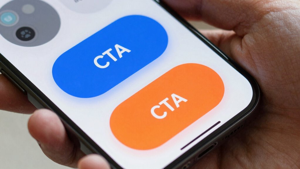
Ensuring your mobile CTA buttons are accessible and inclusive is essential for reaching all users effectively. To achieve this, prioritize these key aspects:
Design mobile CTA buttons with high contrast, size, spacing, and clear labels for full accessibility and inclusivity.
- Use high color contrast between buttons and backgrounds to improve visibility.
- Ensure buttons are large enough for easy tapping and include sufficient spacing.
- Incorporate keyboard accessibility so users can navigate using assistive devices.
- Add clear, descriptive labels to assist users with screen readers.
Frequently Asked Questions
How Does Mobile Device Variability Affect CTA Button Design?
Mobile device variability impacts your CTA button design by requiring a responsive layout that adapts to different screen sizes and resolutions. You need to guarantee the touch target is large enough for easy tapping, regardless of device. By designing flexible, scalable buttons, you improve usability and engagement. Test your buttons across various devices to confirm they’re accessible, responsive, and easy to interact with—key factors for effective mobile CTA performance.
What Are the Latest Trends in Mobile CTA Button Design?
Imagine your users feeling empowered, not frustrated. The latest mobile CTA trends embrace voice-activated buttons and gesture-based interactions, making navigation seamless and intuitive. You should prioritize minimalism, bold contrasts, and clear labels that invite action. Incorporate voice commands and swipe gestures to create dynamic, engaging experiences. By balancing innovation with simplicity, you’ll boost engagement and conversions, ensuring your buttons stand out in an increasingly touchless, voice-driven world.
How Do Cultural Differences Influence CTA Color Choices?
You should consider cultural symbolism and color psychology when choosing CTA colors, as different cultures associate specific colors with emotions or meanings. For instance, red signals urgency in Western cultures but symbolizes luck in China. By understanding these cultural nuances, you can select colors that resonate positively with your audience, increasing engagement and conversions. Tailoring your CTA buttons to cultural expectations guarantees your message feels relevant and compelling across diverse markets.
Can Animated CTA Buttons Improve Click-Through Rates?
Animated CTA buttons can boost click-through rates by up to 20%, making them highly effective. You should incorporate hover effects and motion cues to capture attention and guide user interaction. When users see animated elements, they’re more likely to notice and engage with the button. Keep animations subtle yet purposeful, ensuring they enhance usability without causing distraction, ultimately encouraging more taps and conversions on your mobile site.
How Do User Demographics Impact CTA Design Effectiveness?
Your user demographics greatly influence CTA design effectiveness. By understanding demographic preferences, you can tailor colors, language, and visuals to resonate with your audience. Additionally, analyzing user behavior patterns helps you optimize placement and interaction cues. When you align your CTA with what appeals to specific demographics, you increase engagement and conversions. So, always research your target users’ preferences and behavior to craft compelling, effective CTAs that drive action.
Conclusion
By applying these proven mobile CTA design rules, you’ll boost engagement and conversions. Notably, studies show that simple, clear buttons often outperform complex ones, confirming the power of minimalism. Focus on attention-grabbing size, strategic placement, and compelling text to make your CTAs irresistible. Keep testing and refining—your audience’s preferences evolve. When you optimize thoughtfully, you tap into the psychology of decision-making, turning casual browsers into loyal customers.
