Dark Mode can mess up your emails by causing color clashes, reducing contrast, and making text or images hard to see. To fix this, use high-contrast colors, inline CSS, and media queries like `@media (prefers-color-scheme: dark)`. Test your emails across devices and modes to guarantee they look good everywhere. Keep your designs clear and professional, and if you keep exploring, you’ll find even more effective tricks to save your email style.
Key Takeaways
- Use `@media (prefers-color-scheme: dark)` to customize styles for dark mode and ensure readability.
- Opt for high-contrast color schemes, such as light text on dark backgrounds, to improve visibility.
- Test emails across multiple devices and email clients to identify and fix dark mode rendering issues.
- Override default styles with inline CSS and forced color media queries to maintain design consistency.
- Focus on clear fonts and adequate sizing to prevent blurriness and enhance text clarity in dark mode.
How Does Dark Mode Disrupt Your Email Layouts?

Dark Mode can profoundly disrupt your email layouts because it often changes how colors and backgrounds appear, making your designs look inconsistent or hard to read. When switching to Dark Mode, the system may invert or adjust background colors, which can reduce color contrast and cause essential elements to blend together. This can make your text difficult to see, harming font readability and overall clarity. If your email design relies on specific background and font colors, Dark Mode may distort these choices, leading to a confusing user experience. Without proper adjustments, your carefully crafted visuals can appear unprofessional or unreadable. To prevent this, you need to understand how Dark Mode impacts color contrast and font readability, so you can implement effective fixes. Understanding color adaptation helps you anticipate how your designs will appear across different modes. Additionally, proper testing across various devices and email clients is essential to ensure your layouts remain effective in both light and Dark Mode settings.
Common Dark Mode Email Problems You Need to Know

When designing emails, you may encounter several common issues caused by Dark Mode. One major problem is poor color contrast, where text blends into backgrounds, making it hard to read. Light text on dark backgrounds or vice versa can cause strain if not carefully tested. Another issue is font readability; fonts that look clear in light mode can become blurry or too faint in Dark Mode, reducing legibility. Additionally, images with transparent backgrounds may appear mismatched or washed out against the new background colors. These problems can lead to a confusing or unprofessional appearance, discouraging engagement. Recognizing these common Dark Mode email problems helps you plan solutions, ensuring your emails remain visually appealing and easy to read, regardless of your recipient’s display preferences. Proper color accuracy can also improve overall readability and aesthetic consistency across different display settings. Being aware of Dark Mode compatibility is crucial for maintaining your email design’s integrity.
Design Tips for Dark Mode-Compatible Emails

To create emails that look great in Dark Mode, you need to incorporate design strategies that prioritize contrast and flexibility. Focus on choosing colors with strong contrast to guarantee your content remains readable against dark backgrounds. Use high-contrast color combinations, like light text on dark backgrounds, to improve readability and avoid blending into the background. Additionally, pay close attention to font visibility; select fonts with clear, legible styles and sufficient size to prevent strain. Test your emails across different devices and email clients to confirm your color contrast remains effective. By emphasizing these elements, you ensure your message stands out, regardless of the mode your audience prefers. This approach helps maintain a professional, accessible, and visually appealing email design in Dark Mode.
CSS Tricks to Fix Dark Mode Rendering in Emails

CSS techniques can markedly improve how your emails render in Dark Mode, ensuring your design remains consistent and visually appealing. By using specific CSS tricks, you can control color contrast and font readability, preventing your message from becoming unreadable or unattractive. Incorporating latest tech updates into your email design strategies can help you stay ahead of rendering issues and ensure compatibility across devices and modes. Here are three effective CSS tricks to try:
Master CSS tricks to ensure your emails look stunning and readable in Dark Mode.
- Use `@media (prefers-color-scheme: dark)` to apply targeted styles that adjust background and text colors for Dark Mode.
- Override default styles with inline CSS to maintain proper color contrast, ensuring text stays legible.
- Incorporate `forced colors` media queries to preserve font readability and prevent automatic color swaps from wrecking your design.
These techniques give you control, making sure your email looks great no matter the mode your audience uses.
Testing Your Emails in Light and Dark Modes

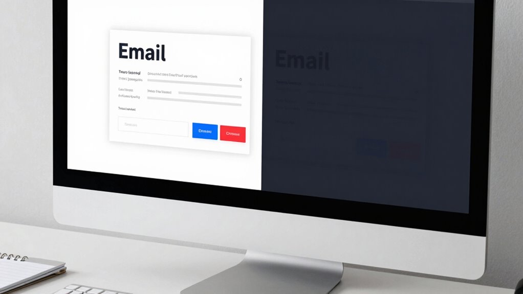
Testing your emails in both light and dark modes is essential to guarantee your design remains effective across different user preferences. Switch between modes to see how your color schemes adapt and ensure they’re visually appealing. Pay close attention to font readability; text should be clear and easy to read, regardless of the background. Use email testing tools or preview features to simulate various environments, catching issues before your campaign goes live. Adjust your color schemes if necessary, making sure that contrast remains strong in both modes. Color contrast is a key factor in accessibility and visual clarity, helping you identify potential problems with visibility or aesthetics, allowing you to refine your design. Ultimately, thorough testing ensures your emails deliver a seamless experience, no matter the display mode your recipients prefer. Embracing artistic expression in your design process can also inspire innovative solutions that enhance user engagement.
Frequently Asked Questions
Which Email Clients Automatically Switch to Dark Mode?
You’ll find that email clients like Apple Mail, Outlook, and Gmail automatically switch to dark mode based on user preferences. This email client compatibility means your design can change unexpectedly, so it’s essential to test how your emails look in different modes. By understanding these automatic shifts, you can create adaptable designs that maintain their appeal, regardless of user preferences or the email client used.
Can Dark Mode Affect Image Visibility in Emails?
Dark mode can totally ruin your email images, making them nearly invisible if you don’t optimize properly. You might notice low image contrast or background transparency issues that cause images to blend into dark backgrounds. To avoid this, use high contrast images and guarantee transparent backgrounds are handled correctly. This way, your visuals stay sharp and clear, even in the most challenging dark mode environments, keeping your design looking professional and engaging.
Are There Specific Fonts Better Suited for Dark Mode Emails?
You should choose font choices that maintain readability in dark mode emails. Opt for sans-serif fonts like Arial or Helvetica, as they’re clearer on dark backgrounds. Use high contrast between text and background, and avoid light-colored fonts on dark backgrounds to prevent eye strain. Incorporate readability tips like adequate font size and spacing. These strategies guarantee your emails are easily readable, regardless of your audience’s preferred mode.
How Can I Prevent Color Bleeding in Dark Mode?
Your emails could be a disaster zone if you don’t prevent color bleeding in dark mode! To stop it, focus on maximizing color contrast—use bold, distinct colors that stand out. Also, tweak background transparency, ensuring your backgrounds don’t blend into dark mode’s black or gray. These simple fixes keep your design crisp, vibrant, and readable, no matter how dark or light your recipient’s display settings are.
Does Dark Mode Impact Email Load Times or Performance?
Dark mode can impact your email’s load times and performance, especially if you include images that don’t render well or have poor optimization. You might notice slower loading or display issues if your images aren’t optimized for dark backgrounds. Additionally, font contrast becomes essential; if your fonts don’t stand out in dark mode, it can affect readability. To improve performance, optimize images and guarantee high contrast between text and background.
Conclusion
To guarantee your emails look great in both modes, you need to adapt your design and test thoroughly. Did you know that over 80% of email users switch to dark mode? This means neglecting dark mode compatibility risks alienating a large portion of your audience. By applying the right CSS tricks and testing across devices, you can deliver consistent, visually appealing emails that engage everyone, no matter their mode preference. Don’t let dark mode wreck your design—fix it now!


