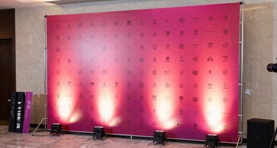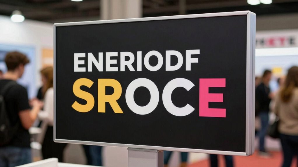

To improve your booth signage’s readability, focus on using vibrant visuals with high contrast, like dark text on a light background. Pick bold, simple fonts that are easy to recognize from a distance, and guarantee your message is clear and prominent. Proper lighting and regular maintenance keep signs attractive and visible throughout the event. If you keep these tips in mind, you’ll be better prepared to attract visitors and stand out successfully.

Get business pricing on office and shipping supplies
- Business-only prices and quantity discounts
- Tax-exempt purchasing
- Multiple users, one account, clear invoices
Key Takeaways
- Use high-contrast colors and bold fonts to ensure text stands out and remains legible from a distance.
- Select simple, easily recognizable fonts and appropriately large lettering for quick readability.
- Optimize signage size and resolution through digital printing for sharp visuals and clear messaging.
- Incorporate proper lighting to enhance visibility and emphasize key signage features.
- Regularly clean and maintain signage to preserve clarity, vibrancy, and overall effectiveness.
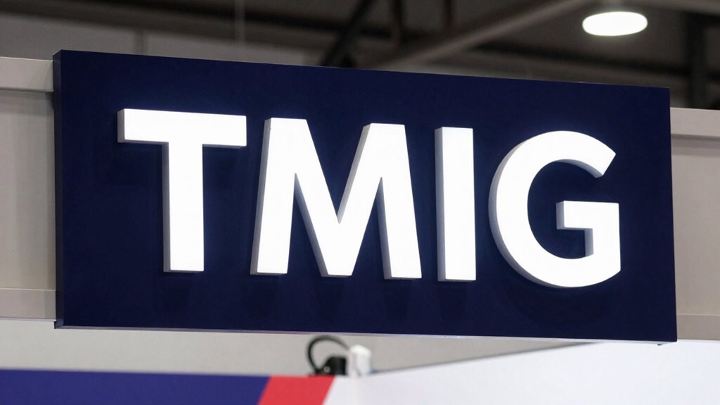
Clear and effective booth signage is essential for attracting visitors and communicating your message quickly. When you’re at an event, attention spans are short, and competition is fierce. Your signage needs to stand out immediately, guiding visitors toward your booth and conveying your core message in a flash. Digital printing plays a crucial role here, offering high-quality, vibrant visuals that make your signage pop. With digital printing, you can produce sharp images and crisp text that catch the eye from a distance, ensuring your booth doesn’t go unnoticed amidst the hustle and bustle.
Effective booth signage attracts attention quickly with vibrant, sharp visuals and clear messaging in any busy event setting.
One of the most critical aspects of readability is color contrast. You need to choose colors that create a stark difference between the background and the text or graphics. When you prioritize strong color contrast, your signage becomes more legible, even from afar. For example, a dark font on a light background or vice versa makes your message clear without straining the eyes. Avoid color combinations that blend together or cause visual confusion, as they can make your signage difficult to read quickly. Instead, opt for bold, contrasting hues that grab attention and enhance clarity.
Size and font choice are also essential. You should select fonts that are simple, bold, and easy to read from various distances. Your message needs to be instantly recognizable, so don’t clutter your signage with overly decorative or intricate fonts. Use large enough lettering to be seen comfortably from a few feet away, and make sure your key messages or branding are prominently displayed. Pair this with digital printing, which allows you to scale your designs easily without sacrificing quality, so your message remains sharp and clear regardless of size. Additionally, considering digital printing quality can significantly impact the overall effectiveness of your signage. Ensuring high print resolution helps maintain clarity and sharpness, especially for detailed visuals.
Lighting can influence how your signage is perceived, so consider how your booth will be lit. Proper lighting can enhance color contrast, highlighting your signage’s benefits even in dimmer environments. When you combine good lighting with high-quality digital printing, your booth signage becomes more dynamic and appealing. Keep in mind that cleanliness and maintenance also matter; dirty or worn signage can diminish your message’s impact, so regularly check and clean your signs to keep them looking professional.
high contrast digital signage printing
As an affiliate, we earn on qualifying purchases.
As an affiliate, we earn on qualifying purchases.
Frequently Asked Questions
How Does Lighting Affect Booth Signage Visibility?
Lighting directly impacts your booth signage visibility by highlighting key elements and reducing shadows. Using effective lighting techniques, like spotlights or LED strips, enhances clarity and draws attention. Proper illumination ensures your signage is easily readable from a distance, making your booth more inviting. For maximum visibility enhancement, position lights strategically so they evenly illuminate your signs, avoiding glare or dark spots that could hinder quick comprehension.
What Materials Are Best for Outdoor Signage?
Did you know that 70% of outdoor signage fails within a year? For durability and weather resistance, you should choose materials like aluminum, which resists rust and corrosion, or high-density polyethylene (HDPE), known for its toughness. These materials withstand harsh weather conditions, ensuring your signage stays clear and effective over time. Using durable, weather-resistant materials helps maintain your booth’s visibility and professionalism, no matter the outdoor elements.
How Can Signage Be Made More Accessible for All Viewers?
To make your signage more accessible for all viewers, you should prioritize inclusive design and universal accessibility. Use high-contrast colors and large, clear fonts to guarantee readability from a distance and for those with visual impairments. Incorporate simple symbols and straightforward language, and consider adding tactile or audio elements where possible. These steps help everyone easily understand your message, creating a welcoming environment that respects diverse needs.
What Are Common Signage Design Mistakes to Avoid?
You might think all signage is effective if it looks good, but avoid common mistakes like poor color contrast and tiny font sizes. These issues make it hard for viewers to read from a distance, especially in busy environments. Make sure your design uses high contrast colors and large, clear fonts. Don’t clutter your signs with too much information—simplicity enhances readability and keeps your message impactful for everyone.
How Often Should Signage Be Updated or Replaced?
You should update or replace signage whenever color contrast or font size no longer guarantees readability. Regularly check if the signage remains clear from a distance, especially in changing lighting conditions. If the colors fade or the font becomes difficult to read, it’s time for an update. Typically, for ongoing events, reviewing signage every few months helps maintain visibility and makes sure your message stays impactful and accessible.
large bold font signage for booths
As an affiliate, we earn on qualifying purchases.
As an affiliate, we earn on qualifying purchases.
Conclusion
So, if you follow these tips, your booth signage will be so readable that attendees won’t just see it—they’ll practically stop in their tracks like it’s a neon lighthouse guiding ships. Your setup will be the talk of the event, drawing crowds faster than a viral meme. Get it right, and you’ll turn your booth into an unstoppable magnet that no one can ignore—guaranteed to make your competitors wish they had your signage secrets!
LED booth lighting for visibility
As an affiliate, we earn on qualifying purchases.
As an affiliate, we earn on qualifying purchases.
maintenance tools for outdoor signs
As an affiliate, we earn on qualifying purchases.
As an affiliate, we earn on qualifying purchases.
Halloween Picks
halloween
As an affiliate, we earn on qualifying purchases.